Cross-Hatching vs. Tonal Shading: Which Should You Use?
Give the same apple to two draughtspeople and you will often get two very different drawings. One builds the shadow with a soft, graduated smear of graphite; the other lays down a lattice of criss-crossing lines until the dark side arrives. Both drawings work. The choice between cross-hatching and tonal shading comes down to three things: the texture you want, the time you have, and how much realism you are chasing.
Where tonal shading wins
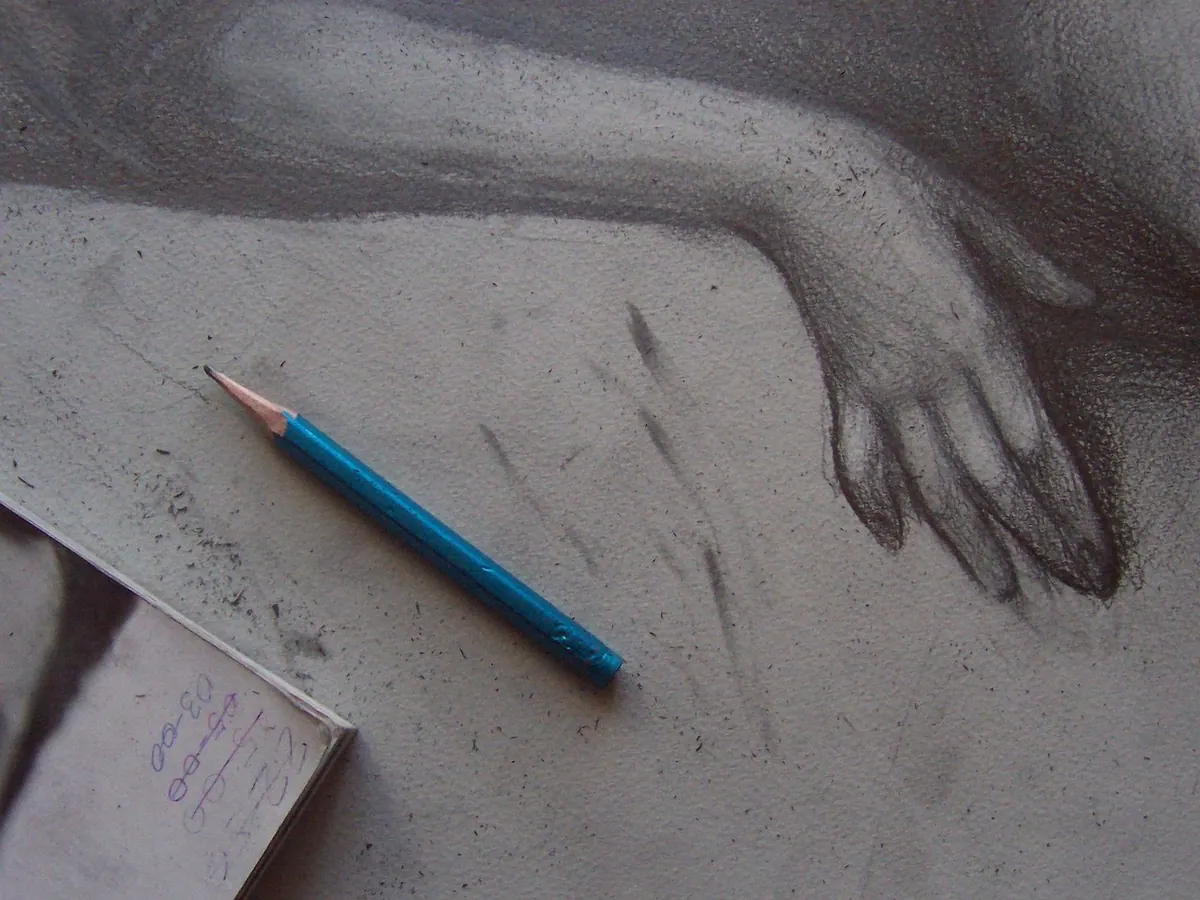
Tonal shading is any method where value is built by blending or layering smooth marks until light turns into dark without a visible edge. Think of graphite softened with a paper stump, charcoal rubbed with a fingertip, pastel laid down in overlapping films, or a soft pencil worked in tight circles until the tooth of the paper disappears.
Its great strength is atmosphere. Skin, silk, polished metal, still water, clouds and glass all reward smooth transitions because their surfaces scatter light gently. On those subjects, realism lives in the slow curve from highlight to core shadow rather than in crisp edges. Tonal work is also forgiving across large areas: a broad sweep with the side of a pencil covers ground quickly, and a kneaded eraser will lift tone if you overshoot.
Watch for muddiness. Graphite burnishes as you rub it, going shiny and refusing to take further layers; charcoal turns to grey sludge if you blend too hard. Work from light to dark, blend in the direction of the form, and keep a scrap sheet beside you to test a value before it lands on the drawing.
Where cross-hatching wins
Cross-hatching is drawing rather than smudging. You lay one set of parallel lines, add a second set across them at an angle, then a third at another angle if the area needs to go darker. Density does the work a blender would otherwise do. You never press harder — you add more lines, closer together.
Because every mark stays visible, hatching carries texture by default. It is the natural language of woven cloth, weathered timber, brick, fur, bark and engraving-style illustration — anything with a rough or fibrous surface. It also reproduces well. A hatched drawing survives scanning, printing and shrinking, while a softly blended one can collapse into grey mush at small sizes.
Speed, texture and realism compared
- Speed: tonal shading is quicker for big, soft areas — a few sweeps and a blend can fill a cheek or a sky in seconds. Cross-hatching takes longer to cover the same square centimetres, but it needs no blending or fixing time, and you can stop at almost any point with the drawing still looking finished.
- Texture: hatching suggests a surface; tonal shading smooths surface away. If your subject is furry, gritty or fibrous, hatching tells the truth more quickly.
- Realism: both can be convincing, but in different registers. Tonal shading mimics how light falls on a smooth form. Hatching describes that form in the language of drawing, so it reads a little more graphic and a little less photographic.
- Corrections: blended tone can be lifted, though erasing often smears what surrounds it. Erased hatching leaves ghost lines, so commit to your darkest passages last.
- Materials: tonal work suits soft pencils, charcoal, pastel and stumps. Hatching suits harder pencils, dip pens and fineliners, where the line stays crisp whatever the paper does underneath.
Matching the method to the subject
Reach for tonal shading when
You are drawing portrait skin, chrome, wet surfaces, glass, graduated skies, soft drapery or any large area where atmosphere matters more than surface. Also use it when you are working at size and need to cover paper fast without a hundred small decisions.
Reach for cross-hatching when
You are drawing rough cloth, wood grain, stone, foliage, animal fur, hair or a busy street scene where edges need to stay legible. It is the better choice for pen work, for sketchbook studies where you may not have time to blend, and for anything destined to be printed small.
Mixing both methods in one drawing
Nothing says you must choose one. A reliable approach is to hatch your shadow shapes first, locking in the value structure, then blend only the softest passages — the turn of a cheek, the underside of a fold — and leave the textured areas hatched. The contrast between smudged and linear passages separates materials without a single drop of colour.
Another hybrid is graduated hatching, where you vary the spacing and length of lines instead of pressing harder. Keep the lines parallel as they fade out, let them shorten, then stop. If you add a light blend over the top, the lines soften but their direction still describes the form.
If a hatched area looks flat, add one more direction of line rather than darkening the lines you already have.
A ten-minute exercise to feel the difference
- Draw two 8cm squares side by side in your sketchbook.
- Shade the left square with blended pencil, moving from near-white on one edge to your darkest value on the other.
- Hatch the right square to the same range of values. Add a new set of lines at roughly thirty to forty-five degrees each time the value needs to deepen.
- Squint at both squares. If the squint makes them look like the same grey, your values match.
- Note the time each one took. Repeat next week with a different subject — a piece of fabric works well.
Build a default, then break it
Pick one method as your default for the next month so your hand gets the repetition it needs, but keep the other within reach. A simple rule covers most drawings: if the surface is smooth, blend; if it has a grain, hatch; if you are short on time, block the big shapes tonally and hatch only the area you want the viewer to look at first.
Try the same object both ways every few weeks. Keep the two versions on the same page and you will start to see which method suits your subjects, your materials and the way you like to work — which is the only comparison that really matters.
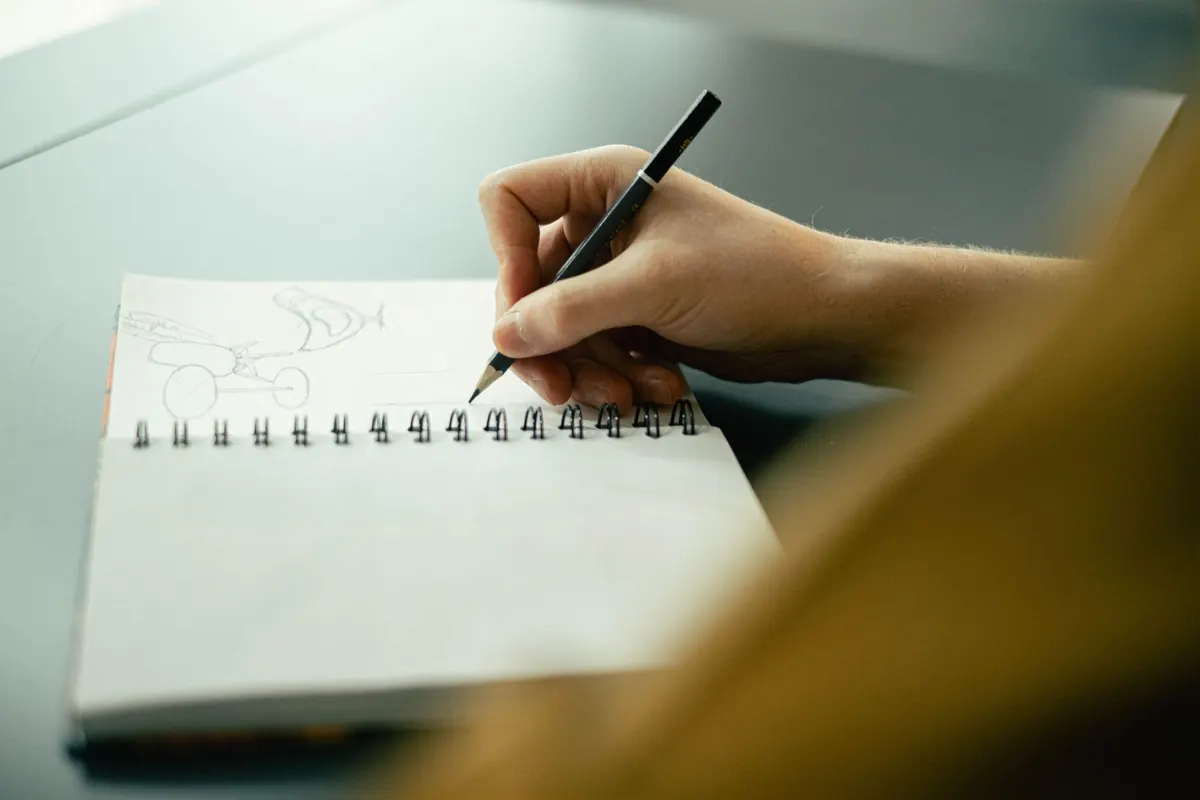
Photo: epicantus / Pixabay
You Might Also Like
A 30-day drawing challenge using household objects, with a week-by-week list, plus practical tips on observation, line confidence and shading habits.
Artist's block is rarely about missing supplies. Five free drawing exercises — timed studies, blind contours, master copies and more — to get your hand moving again.